Summary
CLIENT
Edelman India
(For: RMI India & NITI Aayog – Shoonya Campaign)
Mission
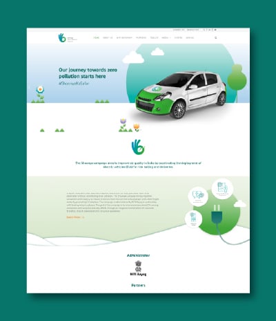
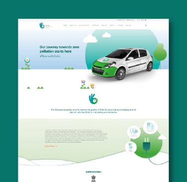
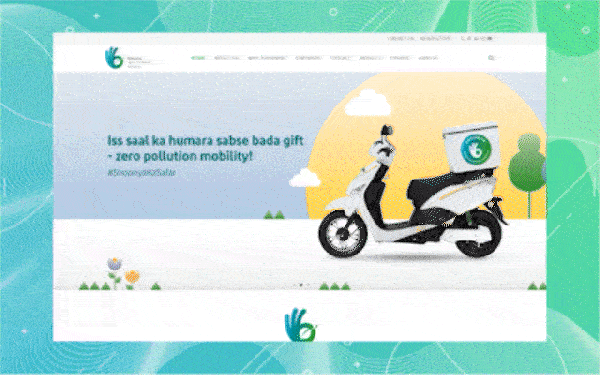
Shoonya is a flagship initiative by NITI Aayog and RMI India, aimed at promoting zero-emission mobility across India. The platform serves as a digital hub to engage citizens, industry partners, and government stakeholders in accelerating the adoption of electric vehicles for urban freight and passenger transport. With its focus on clean air, climate goals, and sustainable logistics, Shoonya helps consolidate resources, campaign materials, impact stories, and provides EV toolkit in one accessible platform.
Services
UI/UX Design
Information Architecture
User Flow Design
Wireframing & Prototyping
Visual Design & Branding Alignment
Responsive Design
Accessibility & Usability Considerations
Design Handoff & Developer Collaboration
Cross-Department Team Communication
My Contributions
As the UI/UX Designer, I was responsible for designing the user experience of the Shoonya platform as part of a project delivered through Edelman. My role involved translating the initiative’s goals into a seamless, engaging, and accessible digital interface. I crafted user flows, wireframes, and high-fidelity mockups to ensure clear navigation, informative layouts, and responsive design across devices. While I did not directly coordinate with RMI India or NITI Aayog, I worked closely with the Edelman team to align the platform with stakeholder expectations and campaign requirements. My focus was on delivering a design that balanced public information with partner engagement, while maintaining usability and visual consistency.
DESIGNING THE Portal
Discovery
The initial phase began with understanding the vision and goals of the Shoonya initiative—promoting zero-emission mobility across India. Since the project was delivered through Edelman for RMI India and NITI Aayog, we collaborated with the Edelman team to gather campaign objectives, audience expectations, and content structure needs. This discovery involved reviewing campaign materials, existing EV adoption data, and stakeholder communication strategies. We analyzed how users—from citizens to industry partners—would engage with the platform and what kind of interface would best communicate the urgency and impact of the movement.
The Process – Step 1
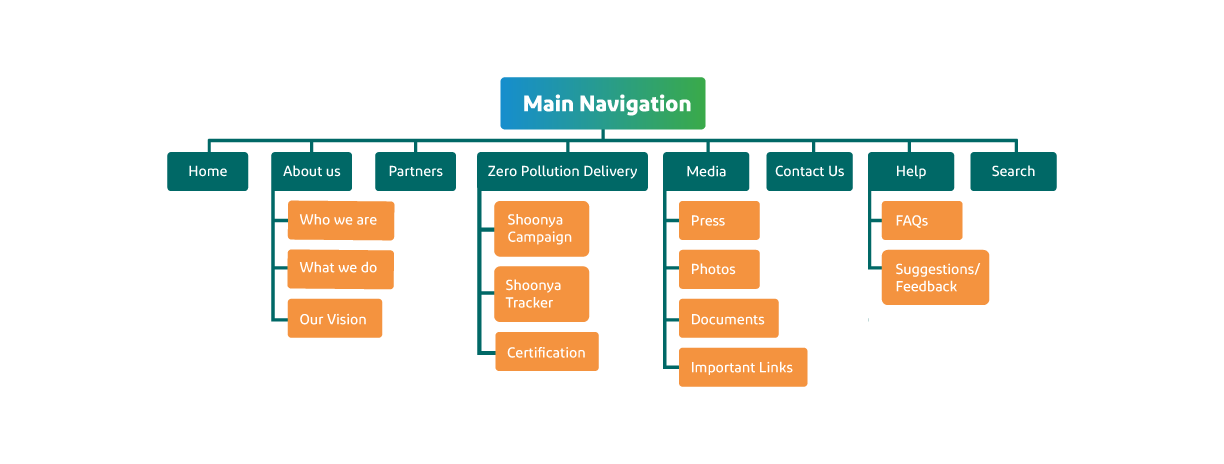
Planning the Portal Structure
After establishing user personas and stakeholder goals, we began mapping the platform’s structure to ensure clarity, usability, and high engagement. We defined key user journeys, including paths for public audiences, media visitors, and campaign partners. We created user flows, wireframes, and a modular layout system to support content types such as stories, data dashboards, partner showcases, and educational resources. The design focused on maintaining consistency while ensuring the experience remained accessible and intuitive across devices and user groups.
Wireframe
Once the platform structure and key user journeys were established, I moved on to designing high-fidelity wireframes that reflected both functionality and visual direction. These wireframes incorporated Shoonya’s campaign branding, color palette, and typographic guidelines as coordinated with Edelman, ensuring consistency with the broader communication strategy.
The primary goal was to create a user-friendly interface that allowed different audiences—citizens, partners, media, and stakeholders—to easily access campaign content, impact data, and participation resources. The wireframes served as a foundation to validate layout decisions and quickly gather feedback from internal stakeholders. They also acted as a reference point for the development team, improving alignment and reducing revisions during implementation.
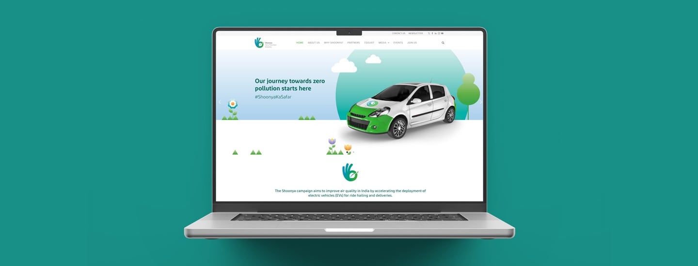
UI Design
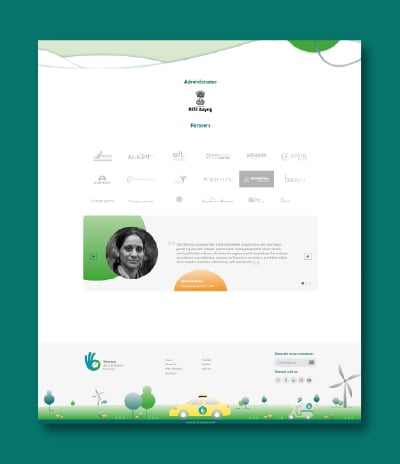
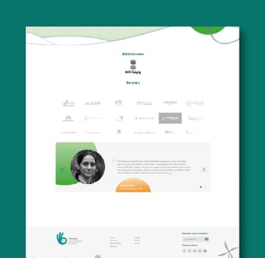
After establishing the information structure and visual direction, I led the UI design for the Shoonya portal, ensuring alignment with the campaign’s branding, messaging, and mission. The goal was to design a clean, accessible, and informative interface that could engage a diverse audience — including government officials, EV manufacturers, fleet operators, and the general public.
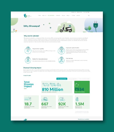
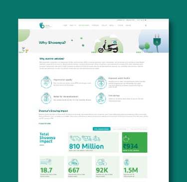
The platform needed to communicate complex data and advocacy material in a clear and digestible way. I focused on creating a design system that balanced informational density with visual clarity, enabling users to easily explore case studies, EV adoption trends, campaign updates, and impact stories. To achieve consistency and scalability, I designed reusable UI components and established visual guidelines around color schemes, iconography, layout grids, and typography. Special attention was given to accessibility and mobile responsiveness, ensuring the portal was intuitive and inclusive across devices.

Development, Test and Launch
Dev Collaboration
Once the designs were finalized, we worked closely with the development team to ensure precise implementation of the UI across all devices and viewports. We handed off pixel-perfect layouts, design assets, and spec documentation using Adobe XD, clearly outlining visual behavior, responsive rules, and interaction details.
To ensure high-quality output, we participated in design QA cycles, reviewing builds on staging, identifying inconsistencies, and providing feedback for refinements. Our collaboration emphasized maintaining design integrity and ensuring performance and accessibility standards were met.
The Process – Step 2
usability testing
While Shoonya didn’t include an admin panel, we still conducted multiple internal reviews and walkthroughs with Edelman and project stakeholders to ensure content was displayed logically and the user experience was clear and purposeful.
These review sessions focused on how diverse audiences—ranging from policymakers to researchers—would navigate the platform. Based on this feedback, we made UX enhancements such as adjusting content hierarchy, improving section-level scannability, and optimizing mobile responsiveness.
Training documentation
To support a seamless launch, we created a detailed style guide, responsive behavior specs, and content placement templates to guide future updates. Since the platform content was to be updated manually, we also shared editable assets and layout instructions that made it easier for the communications team to maintain visual consistency during future content updates.
Shoonya remained involved during post-launch coordination, offering support for any design-level adjustments and ensuring the final live version stayed true to the original intent.
maintenance of THE Portal
Incorporate new modules
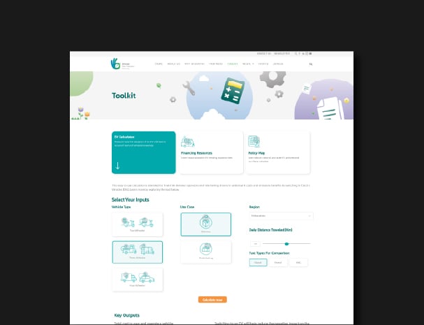
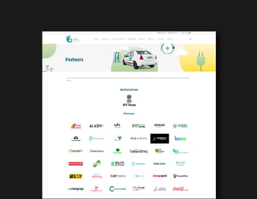
As the Shoonya platform continued to grow, we expanded its capabilities by introducing new modules to highlight progress in India’s clean mobility efforts. One major addition was the EV Toolkit, designed to help stakeholders track developments in electric vehicle policies, infrastructure, and adoption trends across Indian states.
This module featured intuitive data visualizations to support policy makers, researchers, and urban planners. It reflected the evolving landscape of zero-emission mobility in India and provided users with a centralized view of progress under the Shoonya campaign. The toolkit played a key role in promoting awareness and informed decision-making around India’s transition to cleaner transportation solutions.
The Process – Step 3
Refine the existing website
Alongside the rollout of new modules, we continuously improved the Shoonya portal to keep pace with content growth and user expectations. We refined the information architecture, simplified navigation flows, and enhanced page responsiveness to improve the overall user experience.
Based on analytics and stakeholder feedback, we also updated components like iconography, typography, and layout spacing. These changes helped ensure the platform remained accessible, fast-loading, and visually consistent — supporting Shoonya’s goal of making clean mobility information widely usable and engaging across audiences.