Summary
CLIENT
Confidential (US-based)
Mission
Project BLAK was envisioned as a luxury ride-hailing platform that delivers a premium experience through high-end vehicles like Cadillacs. Designed to redefine urban mobility, the mission was to blend technology, sophistication, and convenience to serve an elite clientele. The platform aimed to ensure seamless rides, trusted service, and a high-end digital interface for both passengers and drivers.
Services
UX/UI Design for Web & Mobile
User Flow & Journey Mapping
Wireframing & High-Fidelity Prototyping
Mobile App Design (Passenger + Driver)
Admin Panel UI Design
Responsive Website Design
Brand-Oriented Visual Language
Design System & Style Guide Creation
Developer Collaboration & QA Testing
Multi-User Role Experience Design
My Contributions
As the Lead UX/UI Designer, I was responsible for crafting the complete digital experience for Project BLAK — spanning the passenger app, driver app, admin panel, and marketing website. I conducted competitor research, designed intuitive user flows, created wireframes, and built high-fidelity UI screens that aligned with luxury standards. I ensured the design system reflected exclusivity and ease-of-use, and collaborated closely with developers to maintain consistency across all platforms. My role involved designing for multiple user types while balancing aesthetic elegance and functional clarity.
DESIGNING THE Portal
Discovery
The initial phase centered on understanding the vision of Project BLAK — to build a premium ride-hailing platform tailored for luxury vehicle users. We studied competitor apps, luxury mobility trends, and behavior patterns of high-end service users. Through discussions with stakeholders, we defined functional expectations and key differentiators to set the platform apart in a saturated market. This discovery phase also involved analyzing UI/UX benchmarks from top-tier mobility platforms, understanding personas of both drivers and premium riders, and identifying their distinct priorities.
The Process – Step 1
Planning the Portal Structure
With a clear understanding of Project BLAK’s vision and user personas, we worked with a foundational structure shared by the client to shape the app and platform experience. The core architecture — including key user journeys and modules — was predefined, and our role was to enhance and refine it with UX best practices.
We contributed by designing detailed user flows, improving navigation clarity, and optimizing interactions across modules like ride booking, driver onboarding, and fleet monitoring. Additions included enhancements in user hierarchy logic, layout adjustments, and recommendations for more intuitive microinteractions. Our focus remained on elevating the overall experience, ensuring the platform catered to the expectations of a high-end user base.
Wireframe
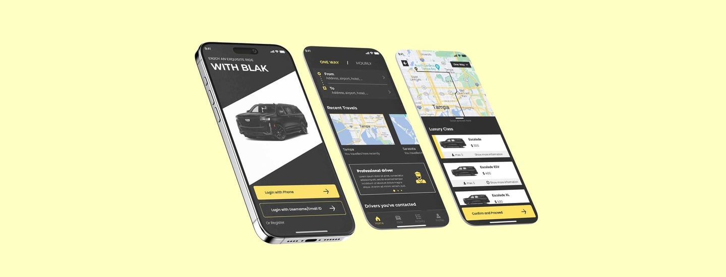
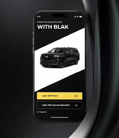
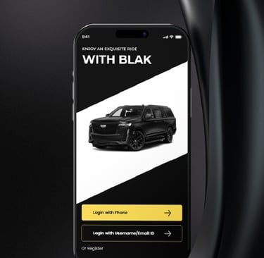
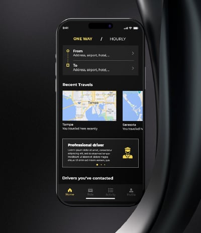
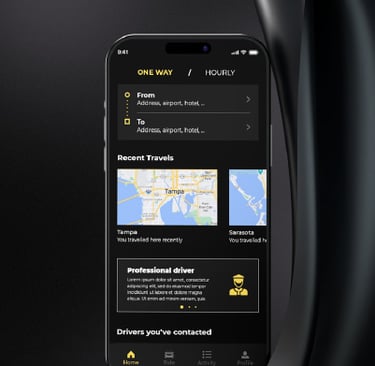
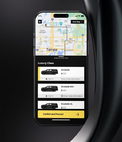
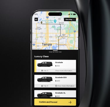
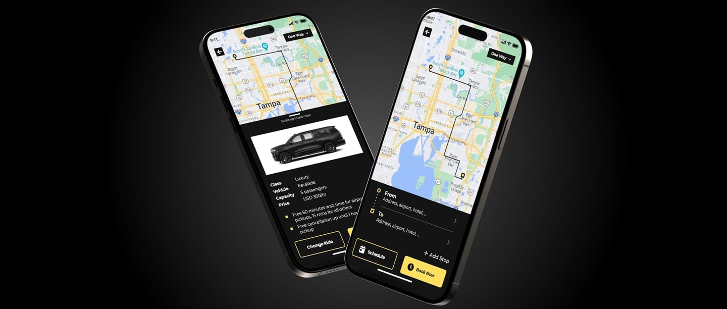
After finalizing the platform structure and mapping user flows for both riders and drivers, I developed high-fidelity wireframes that captured the luxury brand tone and visual sophistication expected by the client. These wireframes served as a blueprint for the design direction — combining functional clarity with sleek aesthetics tailored to premium mobility users.
The focus was on creating a clean, elegant interface that emphasized ease of booking, real-time ride tracking, and seamless driver-rider interactions. The wireframes made it easy for stakeholders to visualize the complete app experience and refine details such as CTA placements, booking flow, and vehicle profile pages. This process also streamlined developer collaboration by reducing ambiguity during handoff and ensuring faster, more accurate implementation of features.
UI Design
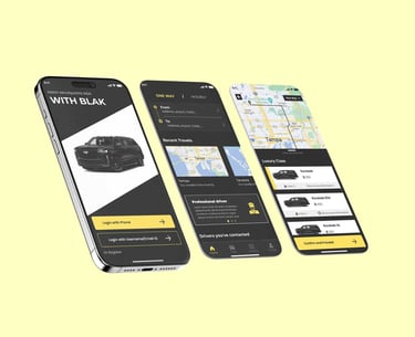
Building on the approved wireframes, I designed the complete UI for the Project BLAK platform — including the passenger app, driver app, admin dashboard, and marketing website. The goal was to deliver a visually refined and premium digital experience that aligned with the brand’s luxury positioning. Every screen was designed to balance elegance with intuitive functionality, tailored for tech-savvy and high-end users.
While initial brand references existed, I expanded and polished the visual system — curating a distinct color palette, refined typography, minimalist iconography, and high-end UI components. The final interface emphasized clarity, responsiveness, and a sleek aesthetic that elevated the user journey. All designs were packaged with detailed specs and assets to ensure smooth handoff and seamless development implementation.
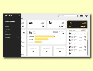
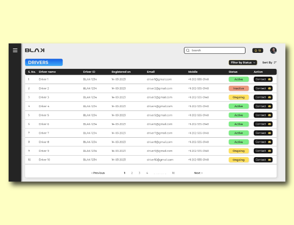
DESIGNING THE Admin Panel
Discovery
The discovery phase for Project BLAK’s Admin Panel focused on identifying the operational needs of fleet managers, support staff, and business administrators who would oversee ride activity, driver performance, and user management. We collaborated with the client and technical teams to understand the backend requirements — including trip data monitoring, account moderation, financial tracking, and user feedback management.
Key exploration areas included multi-role access levels, real-time ride and payment monitoring, driver onboarding workflows, and dispute resolution systems. We also analyzed comparable admin dashboards from top-tier ride-hailing platforms to identify best practices and functionality gaps — ensuring the admin system was both scalable and tailored to BLAK’s luxury positioning.
The Process – Step 2
Planning the Portal Structure
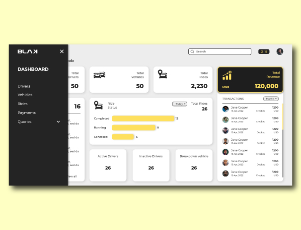
Based on the gathered insights, I structured the Admin Panel to support various roles such as fleet operators, support agents, and super-admins — each with clearly defined access and permissions. I outlined workflows for trip management, issue resolution, revenue tracking, driver approvals, and promo code handling.
I developed functional wireflows and dashboard hierarchies to streamline operations while reducing cognitive load. The panel structure emphasized clarity and real-time control, enabling the admin team to effectively manage dynamic ride activity and user interactions across the platform.
Development, Test and Launch
Dev Collaboration
Once the design system and high-fidelity screens were finalized, I worked closely with the development team to prepare for implementation. I provided detailed specifications, organized component libraries in Figma, and documented interaction behavior to guide developers. We conducted multiple handoff sessions to walk through the UX logic, clarify design decisions, and align on platform architecture.
Although full development was not completed, the process involved sprint-level collaboration and iterative feedback cycles on early prototypes, allowing us to validate technical feasibility and catch potential design inconsistencies in advance.
The Process – Step 3

usability Validation
Before development paused, we tested the interactive prototypes internally and with client stakeholders to validate flows across the rider app, driver app, and admin panel. The goal was to ensure seamless booking experiences, clear ride-tracking interfaces, and intuitive control dashboards.
Feedback from client-side testers led to design adjustments in elements like map zoom behavior, ride summary screens, and navigation logic. These refinements improved the clarity and usability of the prototype, even though the product didn’t proceed to a live launch.
documentation
To support future development efforts, I compiled a complete design handoff package — including Figma files, design tokens, annotated flows, and component specs. I also created a design documentation guide outlining usage patterns, edge case handling, and responsive behavior across devices.
This preparation ensured that if the project resumed at a later date, the development team would have clear and comprehensive design materials ready for implementation.